

The main logo
The logotype is custom. The A is a straight razor, which makes the name and the trade a single shape, and the ornamental diamonds on both sides give it the feel of old shop signage. “Established 2024” and “Barber Co.” sit above and below in a clean sans, so the name stays the loudest thing in the mark.
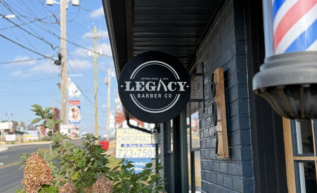
The badge
For stamps, signage and anything round, the logo sits inside a double ring. It works as a sticker, a window decal, or a stamp on a receipt.
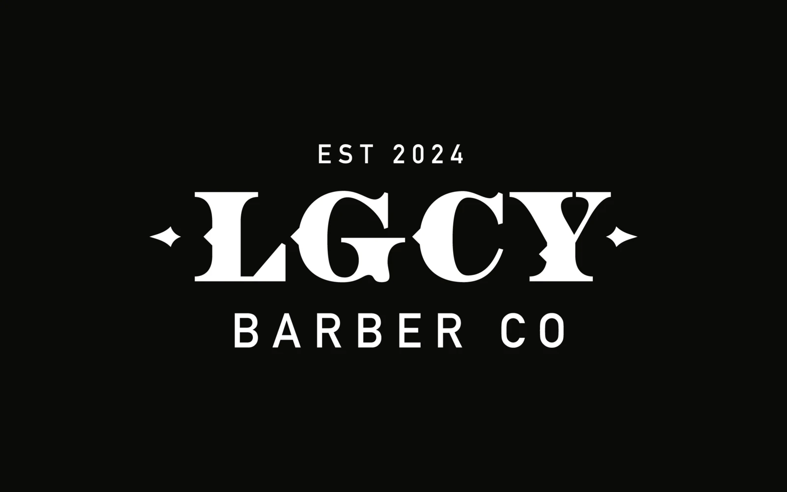
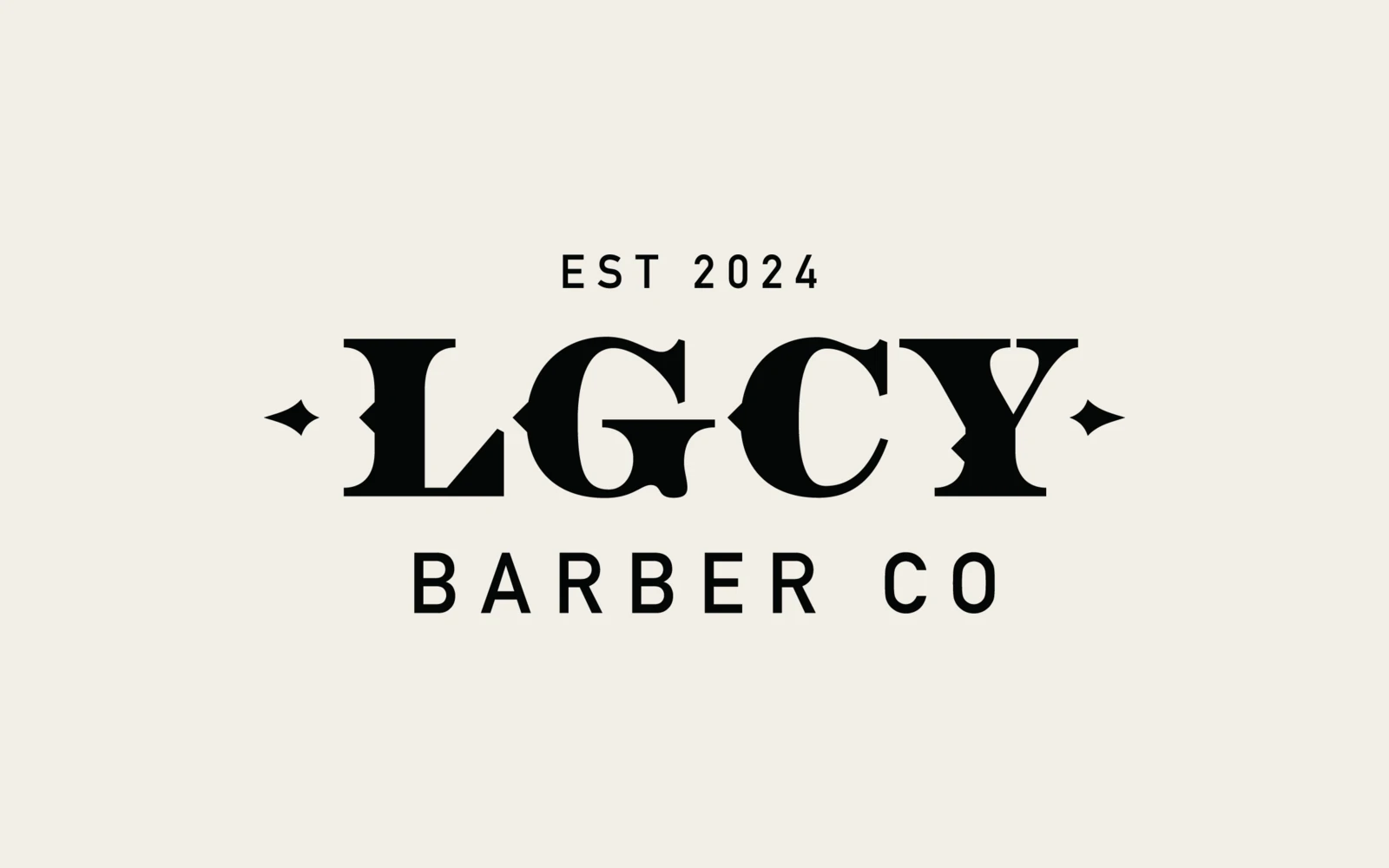
The minimal lockup
A shorter version for tight spaces. “LGCY” keeps the same letterforms and the same diamonds, so it reads as the same brand at a smaller size.
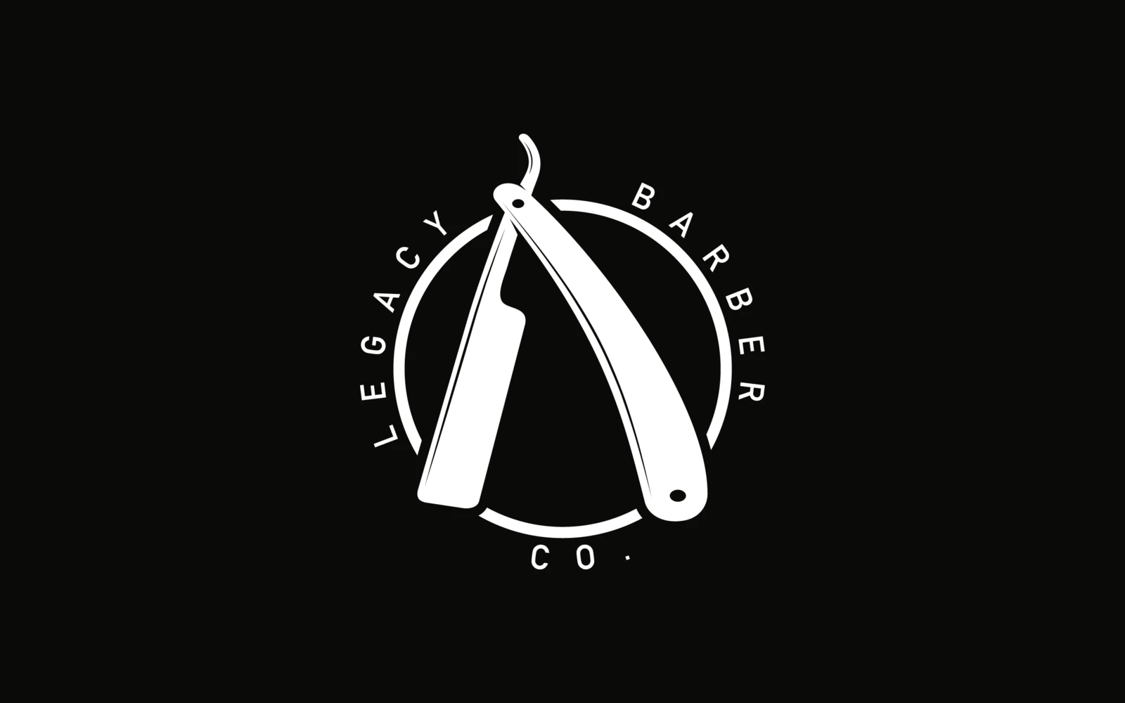
Alternate lockups
Two round marks for places where a wide logo doesn’t fit: the razor on its own inside a ring with the name set around it, and the “L” with the name set in a circle around it.
The mark
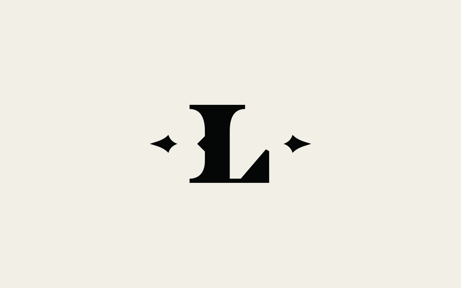
The “L” with its diamonds is the smallest version of the brand. It’s built for favicons, social profile pictures and anywhere the logo has to work at a few dozen pixels.
Type
The logotype is custom. The secondary typeface is DIN Alternate Bold, used for the supporting lines and for everything set in small caps.